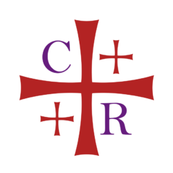
Our logo is a rendition of the Jerusalem Cross.
The Jerusalem Cross is a traditional emblem of the Christian faith with rich roots in the Holy Land. Its four arms reach out to the four corners of the globe, representing the spread of the Gospel around the world.
In recent years, the Jerusalem Cross has become an emblem of the renewal movement in the Anglican Communion. Our Province was formed through the Jerusalem Declaration of 2008 which also birthed the Global Anglican Future Conference (GAFCON). GAFCON includes the Jerusalem Cross in its logo, and the Anglican Church in North America chose the Jerusalem Cross to adorn the cover of the 2019 Book of Common Prayer.
Focusing our logo on the cross emphasizes the redemptive work of Christ while articulating our connection to the Anglican movement.
Our logo utilizes three of the primary colors of the Church’s year:
- Red for Christ’s redemptive work which is used at Pentecost and Holy Week
- Purple for the royalty of Christ which is used at Lent and Advent
- .White for the purity of Christ which is used at Easter and Christmas
Our motto or slogan, “we are because He is,” states in a simple and direct way our reason for being, corporately as a community of believers and interchanged individually with “i am because He is.”

